The goal of this module is to build a solid foundation in handling, manipulating, and visualizing spatial data in R. We will focus on the “tidyverse” approach to spatial analysis, which treats spatial data as a special kind of data frame, making many operations intuitive.
By the end of this notebook, you will be able to:
Set up your R environment by loading the essential packages for geospatial analysis.
Understand, load, inspect, and manipulate vector data using the sf package.
Understand, load, and perform fundamental operations on raster data using the terra package.
Create beautiful and informative static maps using the tmap and ggplot2 packages.
Generate interactive maps for data exploration using tmap’s “view” mode.
1.1 Setup: Installing and Loading Core Packages
For our work, we will rely on a core set of packages that form the backbone of modern spatial analysis in R.
If you have not installed these packages before, you must do so first. You can run the install.packages() function in your R console for each one. You only need to do this once.
Show/Hide Code
# Run these lines in your R console if you haven't installed the packages yet# install.packages("sf")# install.packages("terra")# install.packages("tmap")# install.packages("ggplot2")# install.packages("dplyr")# install.packages("spData")# install.packages("geodata")# install.packages("spDataLarge", repos = "https://nowosad.github.io/drat/", type = "source")
Once installed, we need to load the packages into our current R session using the library() function. We do this at the start of every script.
Show/Hide Code
# --- Core Packages ---library(sf) # Handles vector data (Simple Features). The modern standard.library(terra) # Handles raster data. The modern, high-performance successor to the 'raster' package.library(tmap) # For thematic maps (ggplot2-style, but for maps).library(ggplot2) # Grammar of graphics for visualization.library(dplyr) # Grammar of data manipulation; works well with 'sf'.# --- Data Packages ---library(spData) # Contains example spatial datasets for practice.library(geodata) # For downloading common global spatial datasets like country boundaries or climate data.
1.2 Vector Data with sf
What is Vector Data?
Vector data represents geographical features using discrete geometric objects: Points, Lines, and Polygons.
The sf Object
The sf package provides a framework for working with vector data in R. An sf object is fundamentally an R data frame with a special list-column that stores the geometry. This structure is powerful because it allows you to use dplyr verbs directly on your spatial data.
Worked Example: Exploring World Countries
Let’s load the world dataset from the spData package and see what an sf object looks like.
Show/Hide Code
# Load the 'world' datasetdata(world)# 1. Inspect the object's classclass(world)
[1] "sf" "tbl_df" "tbl" "data.frame"
Show/Hide Code
# 2. Print the objectprint(world)
Simple feature collection with 177 features and 10 fields
Geometry type: MULTIPOLYGON
Dimension:     XY
Bounding box:  xmin: -180 ymin: -89.9 xmax: 180 ymax: 83.64513
Geodetic CRS:  WGS 84
# A tibble: 177 × 11
   iso_a2 name_long continent region_un subregion type  area_km2     pop lifeExp
 * <chr>  <chr>     <chr>     <chr>     <chr>     <chr>    <dbl>   <dbl>   <dbl>
 1 FJ     Fiji      Oceania   Oceania   Melanesia Sove…   1.93e4  8.86e5    70.0
 2 TZ     Tanzania  Africa    Africa    Eastern … Sove…   9.33e5  5.22e7    64.2
 3 EH     Western … Africa    Africa    Northern… Inde…   9.63e4 NA         NA
 4 CA     Canada    North Am… Americas  Northern… Sove…   1.00e7  3.55e7    82.0
 5 US     United S… North Am… Americas  Northern… Coun…   9.51e6  3.19e8    78.8
 6 KZ     Kazakhst… Asia      Asia      Central … Sove…   2.73e6  1.73e7    71.6
 7 UZ     Uzbekist… Asia      Asia      Central … Sove…   4.61e5  3.08e7    71.0
 8 PG     Papua Ne… Oceania   Oceania   Melanesia Sove…   4.65e5  7.76e6    65.2
 9 ID     Indonesia Asia      Asia      South-Ea… Sove…   1.82e6  2.55e8    68.9
10 AR     Argentina South Am… Americas  South Am… Sove…   2.78e6  4.30e7    76.3
# ℹ 167 more rows
# ℹ 2 more variables: gdpPercap <dbl>, geom <MULTIPOLYGON [°]>
Show/Hide Code
# 3. Manipulate data with dplyrworld_africa <- world %>%filter(continent =="Africa") %>%select(name_long, pop, gdpPercap, lifeExp, geom)# Let's look at our new, smaller sf objectprint(world_africa)
Simple feature collection with 51 features and 4 fields
Geometry type: MULTIPOLYGON
Dimension:     XY
Bounding box:  xmin: -17.62504 ymin: -34.81917 xmax: 51.13387 ymax: 37.34999
Geodetic CRS:  WGS 84
# A tibble: 51 × 5
   name_long                     pop gdpPercap lifeExp                      geom
   <chr>                       <dbl>     <dbl>   <dbl>        <MULTIPOLYGON [°]>
 1 Tanzania                   5.22e7     2402.    64.2 (((33.90371 -0.95, 31.86…
 2 Western Sahara            NA            NA     NA   (((-8.66559 27.65643, -8…
 3 Democratic Republic of t…  7.37e7      785.    58.8 (((29.34 -4.499983, 29.2…
 4 Somalia                    1.35e7       NA     55.5 (((41.58513 -1.68325, 41…
 5 Kenya                      4.60e7     2753.    66.2 (((39.20222 -4.67677, 39…
 6 Sudan                      3.77e7     4188.    64.0 (((23.88711 8.619775, 24…
 7 Chad                       1.36e7     2077.    52.2 (((23.83766 19.58047, 19…
 8 South Africa               5.45e7    12390.    61.0 (((16.34498 -28.57671, 1…
 9 Lesotho                    2.15e6     2677.    53.3 (((28.97826 -28.9556, 28…
10 Zimbabwe                   1.54e7     1925.    59.4 (((31.19141 -22.25151, 3…
# ℹ 41 more rows
Show/Hide Code
# 4. Check the Coordinate Reference System (CRS)st_crs(world_africa)
Coordinate Reference System:
  User input: EPSG:4326
  wkt:
GEOGCRS["WGS 84",
    DATUM["World Geodetic System 1984",
        ELLIPSOID["WGS 84",6378137,298.257223563,
            LENGTHUNIT["metre",1]]],
    PRIMEM["Greenwich",0,
        ANGLEUNIT["degree",0.0174532925199433]],
    CS[ellipsoidal,2],
        AXIS["geodetic latitude (Lat)",north,
            ORDER[1],
            ANGLEUNIT["degree",0.0174532925199433]],
        AXIS["geodetic longitude (Lon)",east,
            ORDER[2],
            ANGLEUNIT["degree",0.0174532925199433]],
    USAGE[
        SCOPE["Horizontal component of 3D system."],
        AREA["World."],
        BBOX[-90,-180,90,180]],
    ID["EPSG",4326]]
Show/Hide Code
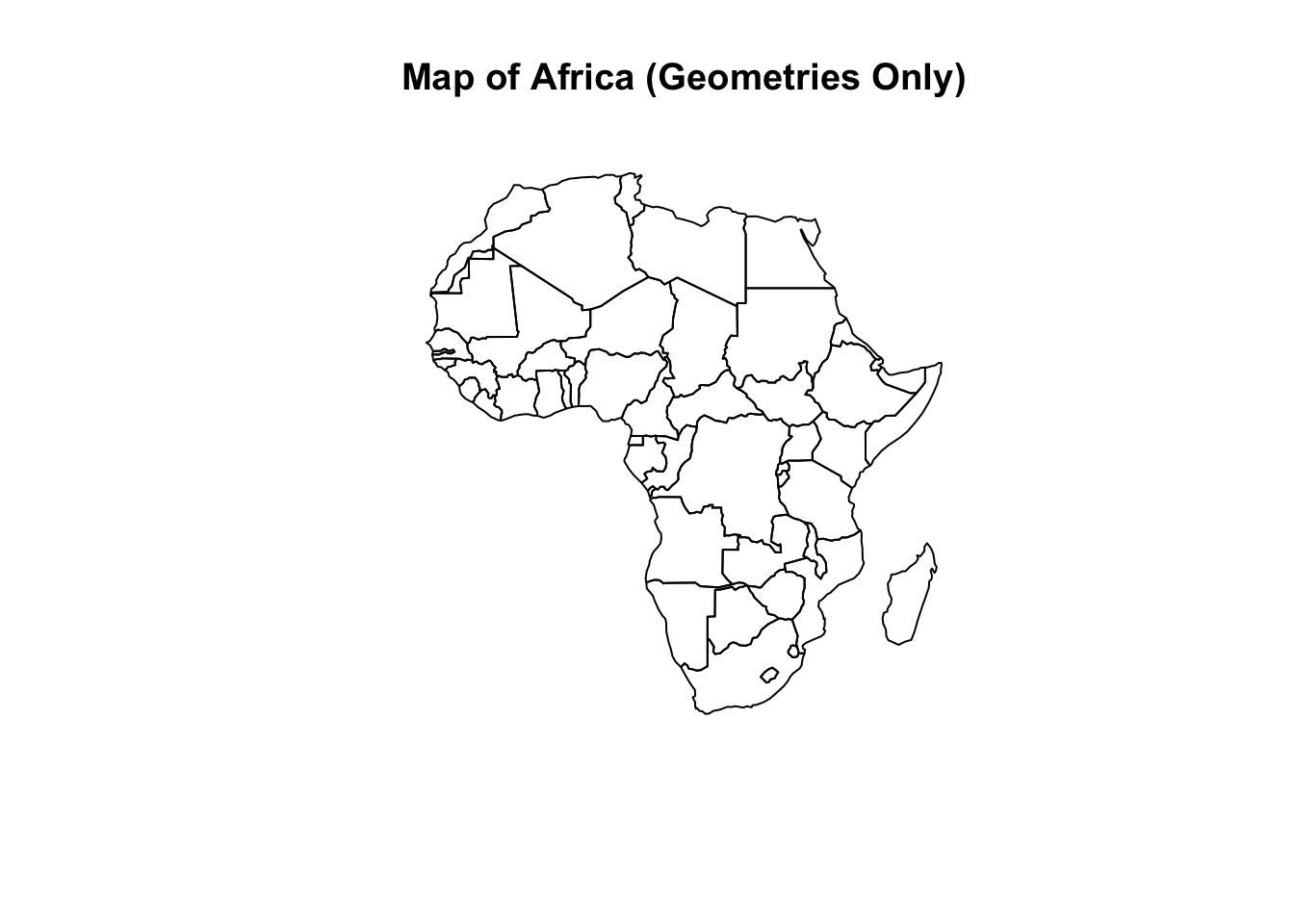
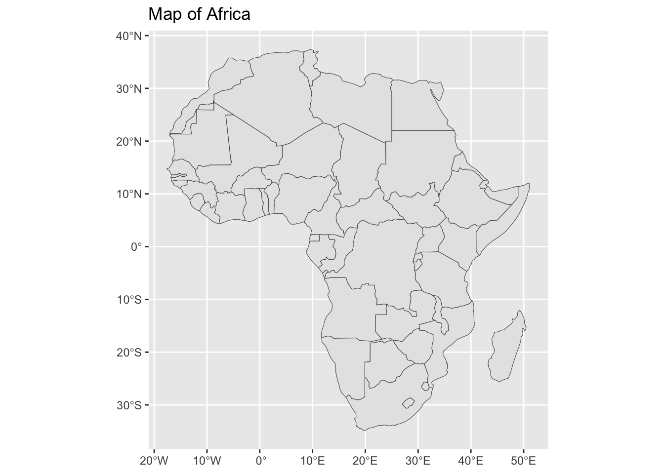
# 5. Basic Plottingplot(st_geometry(world_africa), main ="Map of Africa (Geometries Only)")
Exercise 1: Vector Data Manipulation
Now it’s your turn. Use the us_states dataset, which is also included in the spData package.
Calculate the area of each western state using st_area(). The result will be in square meters. Create a new column in your western_states object called area_sqkm that contains the area in square kilometers (Hint: 1 \(km^2\) = 1,000,000 \(m^2\) ).
Show/Hide Code
# Your code here
Show/Hide Code
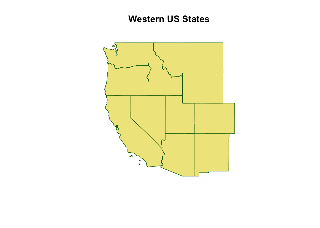
# First, create the 'western_states' object from the previous taskwestern_states <- us_states %>%filter(REGION =="West")# Now, add the new area columnwestern_states_with_area <- western_states %>%mutate(area_sqkm =st_area(.) /1000000)# View the NAME and the new area columnprint(western_states_with_area[, c("NAME", "area_sqkm")])
Create a simple plot of your western_states object using plot(). Customize it by changing the color of the polygons (col) and their borders (border).
Show/Hide Code
# Your code here
Show/Hide Code
# First, create the 'western_states' object from task 2western_states <- us_states %>%filter(REGION =="West")plot(st_geometry(western_states), main ="Western US States", col ="khaki", border ="darkgreen")
1.3 Raster Data with terra
What is Raster Data?
While vector data uses discrete shapes, raster data represents the world as a continuous grid of cells, or pixels. Each pixel in the grid has a value representing some measured phenomenon. Think of it like a digital photograph.
Epidemiological examples: Satellite imagery, elevation models, or surfaces showing environmental variables like land surface temperature, precipitation, or vegetation density (NDVI).
The terra Package
The terra package is the modern, high-performance engine for raster data in R. It is designed to be easier to use and much faster than its predecessor, the raster package, especially with the very large files common in remote sensing.
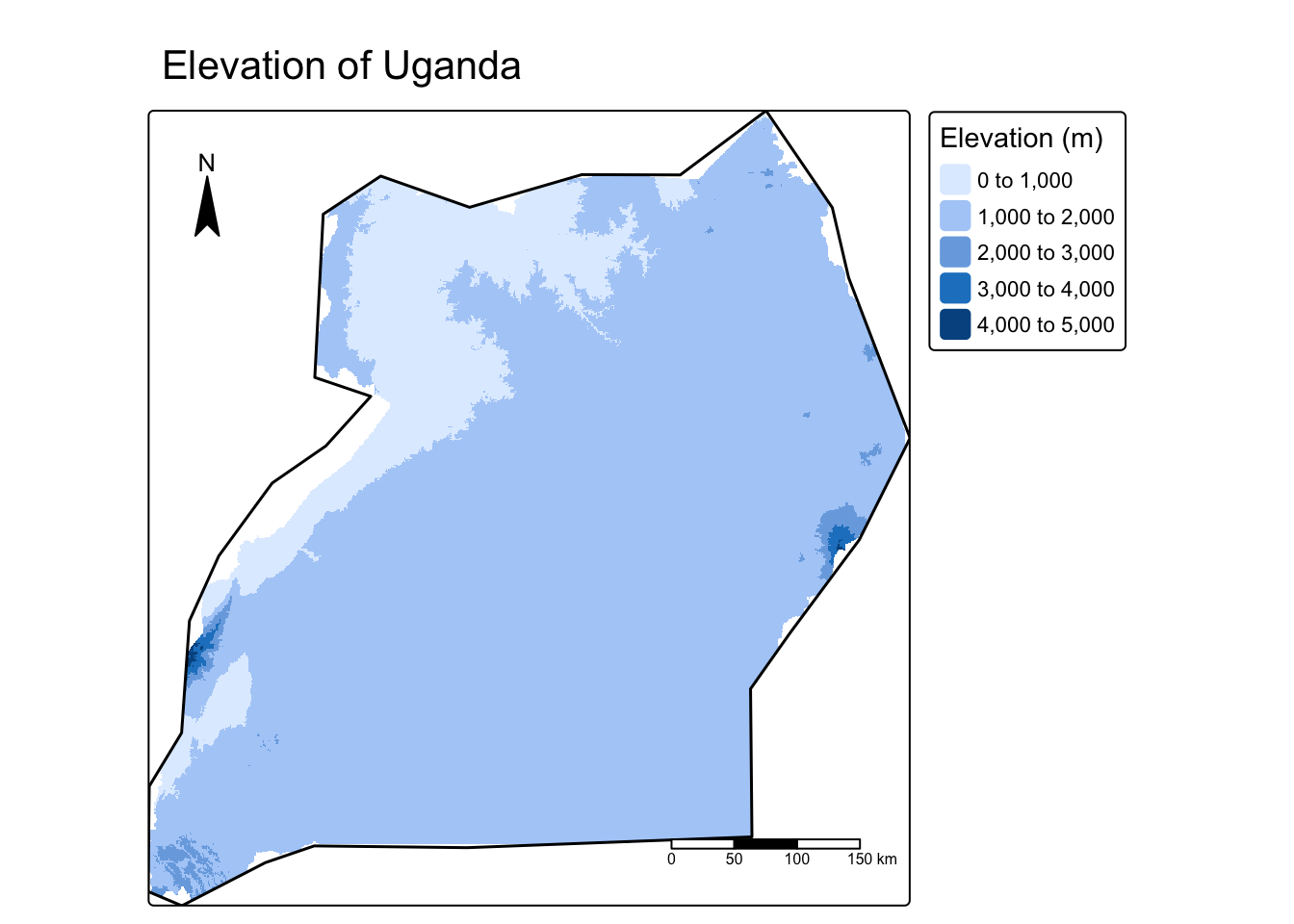
Worked Example: Exploring Elevation in Uganda
Let’s download elevation data for Uganda and perform two fundamental raster operations: cropping and masking.
Show/Hide Code
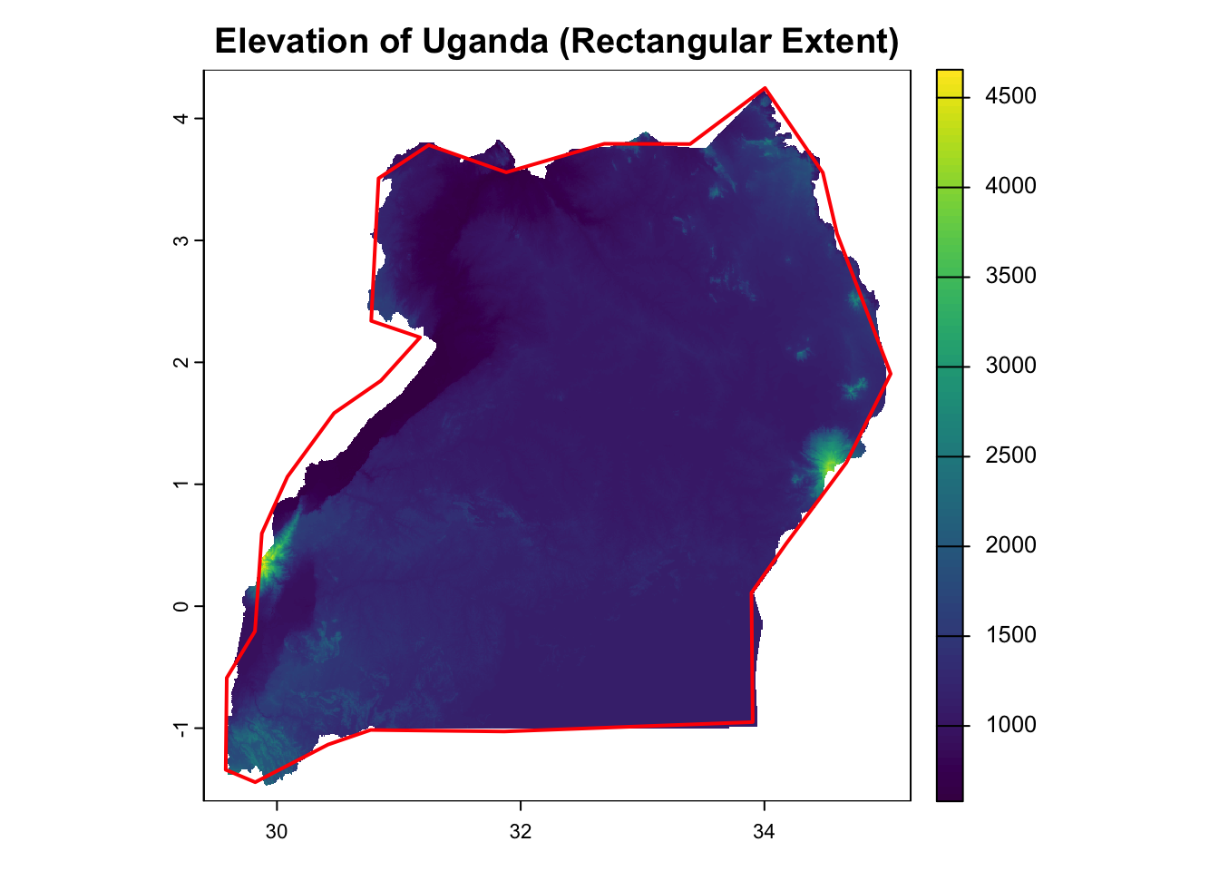
# We will use the sf object for Uganda we can get from the 'world' datasetuganda_sf <- world %>%filter(iso_a2 =="UG")# 1. Download Data# The geodata package can download various global datasets.# We will get elevation data at 30-arcsecond resolution.temp_path <-tempdir()elevation_uganda <- geodata::elevation_30s(country ="UGA", path = temp_path)# 2. Inspect the SpatRaster Objectprint(elevation_uganda)
class       : SpatRaster
size        : 720, 696, 1  (nrow, ncol, nlyr)
resolution  : 0.008333333, 0.008333333  (x, y)
extent      : 29.4, 35.2, -1.6, 4.4  (xmin, xmax, ymin, ymax)
coord. ref. : lon/lat WGS 84
source      : UGA_elv_msk.tif
name        : UGA_elv_msk
min value   :         580
max value   :        4656
Show/Hide Code
# 3. Basic Plottingplot(elevation_uganda, main ="Elevation of Uganda (Rectangular Extent)")plot(st_geometry(uganda_sf), add =TRUE, border ="red", lwd =2)
Show/Hide Code
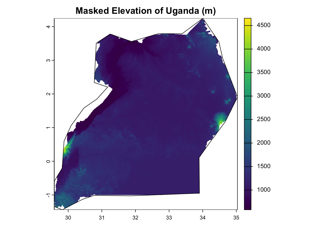
# 4. Crop and Maskelevation_cropped <-crop(elevation_uganda, uganda_sf)elevation_masked <-mask(elevation_cropped, uganda_sf)# 5. Plot the Final Resultplot(elevation_masked, main ="Masked Elevation of Uganda (m)")plot(st_geometry(uganda_sf), add =TRUE, border ="black", lwd =1)
Exercise 2: Raster Data Manipulation
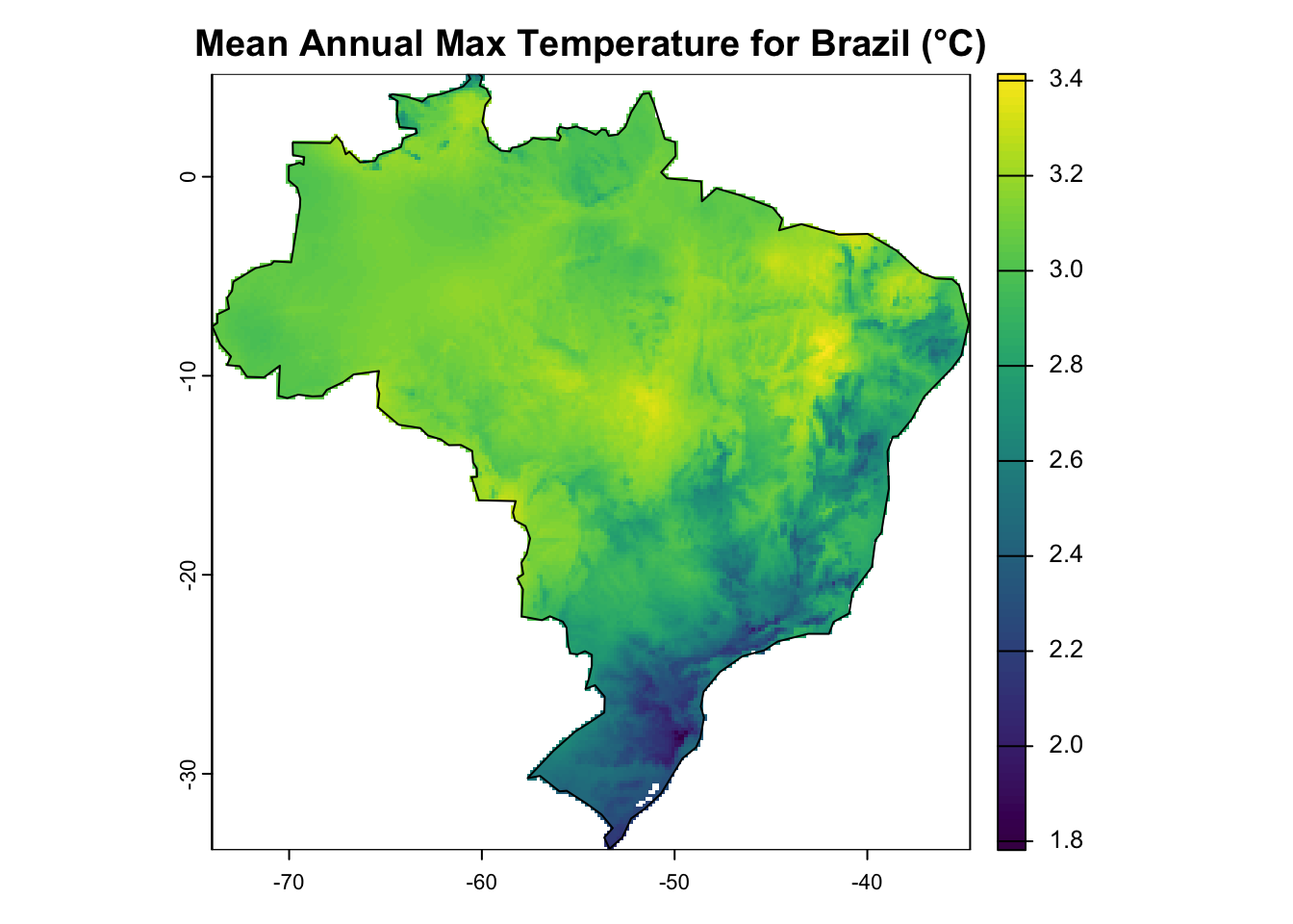
Let’s practice these skills by creating a map of the mean annual temperature for Brazil.
Download the global average maximum temperature data from WorldClim at 10-minute resolution. This will be a SpatRaster with 12 layers (one for each month). Calculate the mean across all 12 layers to get a single-layer raster of the annual average. Remember: The data is in °C * 10, so you’ll need to divide the final result by 10.
Show/Hide Code
# Your code here
Show/Hide Code
temp_path <-tempdir() # Define temp_path if not already definedglobal_tmax <- geodata::worldclim_global(var ="tmax", res =10, path = temp_path)mean_annual_tmax <-mean(global_tmax)mean_annual_tmax_c <- mean_annual_tmax /10# Optional: print the final raster object to check itprint(mean_annual_tmax_c)
class       : SpatRaster
size        : 1080, 2160, 1  (nrow, ncol, nlyr)
resolution  : 0.1666667, 0.1666667  (x, y)
extent      : -180, 180, -90, 90  (xmin, xmax, ymin, ymax)
coord. ref. : lon/lat WGS 84
source(s)   : memory
name        :      mean
min value   : -4.970683
max value   :  3.851019
Crop and then mask the global temperature raster (mean_annual_tmax_c) to the exact shape of Brazil.
Show/Hide Code
# Your code here
Show/Hide Code
# Re-create objects from previous tasks to make this chunk self-containedtemp_path <-tempdir()global_tmax <- geodata::worldclim_global(var ="tmax", res =10, path = temp_path)mean_annual_tmax_c <-mean(global_tmax) /10brazil_sf <- world %>%filter(name_long =="Brazil")# Now perform the crop and masktmax_brazil_cropped <-crop(mean_annual_tmax_c, brazil_sf)tmax_brazil_masked <-mask(tmax_brazil_cropped, brazil_sf)print(tmax_brazil_masked)
class       : SpatRaster
size        : 234, 236, 1  (nrow, ncol, nlyr)
resolution  : 0.1666667, 0.1666667  (x, y)
extent      : -74, -34.66667, -33.83333, 5.166667  (xmin, xmax, ymin, ymax)
coord. ref. : lon/lat WGS 84
source(s)   : memory
name        :     mean
min value   : 1.781475
max value   : 3.414175
Plot your final masked temperature raster for Brazil. Add the country’s border to the plot for context.
Show/Hide Code
# Your code here
Show/Hide Code
# Re-create the necessary objects from previous taskstemp_path <-tempdir()global_tmax <- geodata::worldclim_global(var ="tmax", res =10, path = temp_path)mean_annual_tmax_c <-mean(global_tmax) /10brazil_sf <- world %>%filter(name_long =="Brazil")tmax_brazil_masked <-mask(crop(mean_annual_tmax_c, brazil_sf), brazil_sf)# Now create the plotplot(tmax_brazil_masked, main ="Mean Annual Max Temperature for Brazil (°C)")plot(st_geometry(brazil_sf), add =TRUE, border ="black")
1.4 Creating Maps with tmap
While plot() is great for quick checks, the tmap package provides a flexible system for creating publication-quality thematic maps. It uses a “grammar of graphics” approach, similar to ggplot2, where you build a map layer by layer.
The main components are: * tm_shape(): Specifies the sf or SpatRaster object to be mapped. * tm_polygons(), tm_lines(), tm_dots(), tm_raster(): Specify how to draw the shape. * tm_layout(), tm_compass(), tm_scale_bar(): Functions to customize the map’s appearance and add map furniture.
A key feature of tmap is its dual-mode functionality. You can create: 1. Static Maps (tmap_mode("plot")): High-quality images suitable for publications, reports, and presentations. 2. Interactive Maps (tmap_mode("view")): Dynamic maps that you can pan, zoom, and query in a web browser or the RStudio Viewer. This is very useful for data exploration.
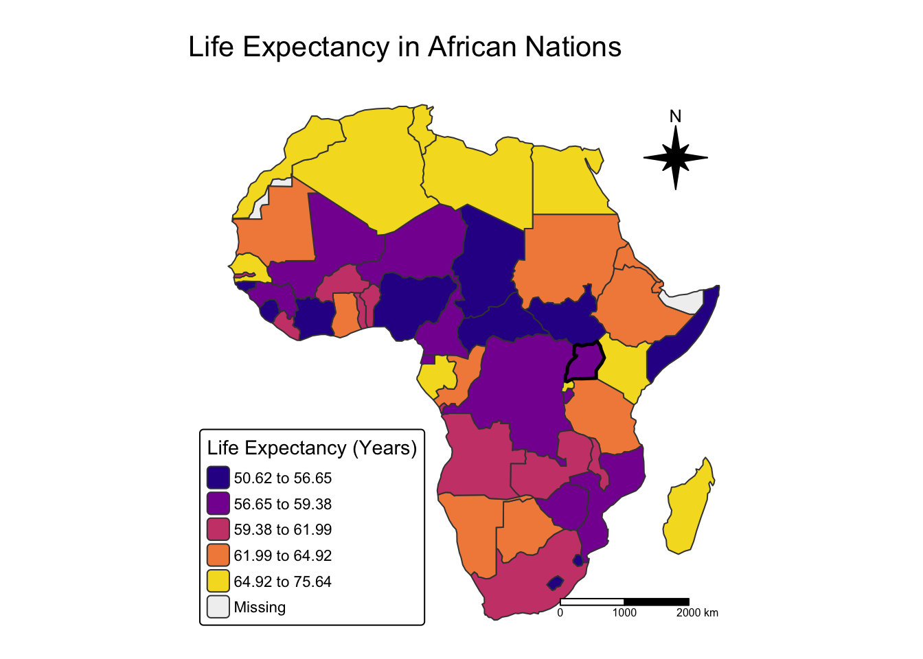
Worked Example: Static Maps
Let’s create a high-quality map showing life expectancy in Africa, highlighting Uganda, and another map showing Uganda’s elevation.
Show/Hide Code
# Set tmap mode to "plot" for static maps.tmap_mode("plot")# Map 1: A Choropleth Map of Life Expectancy# A choropleth map is one where polygons are colored according to a variable's value.map1 <-tm_shape(world_africa) +tm_polygons(col ="lifeExp", # The column to mappalette ="plasma", # Color palettestyle ="quantile", # How to break data into color binstitle ="Life Expectancy (Years)"# Legend title ) +tm_shape(uganda_sf) +# Add a new shape layer for Ugandatm_borders(col ="black", lwd =2.5) +# Draw its borderstm_layout(main.title ="Life Expectancy in African Nations",main.title.position ="center",legend.position =c("left", "bottom"),frame =FALSE, inner.margins =c(0.05, 0.1, 0.05, 0.05) ) +tm_compass(type ="8star", position =c("right", "top"), size =3) +tm_scale_bar(position =c("right", "bottom"), breaks =c(0, 1000, 2000))# Map 2: Combining Raster and Vector Data# Let's map the masked Uganda elevation raster we created earlier.map2 <-tm_shape(elevation_masked) +tm_raster(title ="Elevation (m)" ) +tm_shape(uganda_sf) +tm_borders(lwd =1.5, col ="black") +tm_layout(main.title ="Elevation of Uganda") +tm_compass(type ="arrow", position =c("left", "top")) +tm_scale_bar()# Print the mapsmap1map2
Interactive Mode
For data exploration, the interactive mode of tmap is especially useful. By simply running tmap_mode("view") once, all subsequent tmap plots become interactive Leaflet maps. You can click on features to see their data, zoom in on areas of interest, and switch between different basemaps. This is invaluable for sanity-checking your data and discovering patterns.
Let’s take our first map and view it interactively.
Show/Hide Code
# Switch to interactive view modetmap_mode("view")# Re-run the same code for our first map# No other changes are needed!tm_shape(world_africa) +tm_polygons(fill ="lifeExp",# When hovering, show the country name and its life expectancypopup.vars =c("Country"="name_long", "Life Expectancy"="lifeExp") ) +tm_shape(uganda_sf) +tm_borders(col ="black", lwd =2.5) +tm_layout(main.title ="Interactive Map of Life Expectancy in Africa")
Show/Hide Code
# --- IMPORTANT ---# Switch back to plot mode for the rest of the documenttmap_mode("plot")
Exercise 3: Thematic Mapping with tmap
Now, create your own high-quality map of the United States.
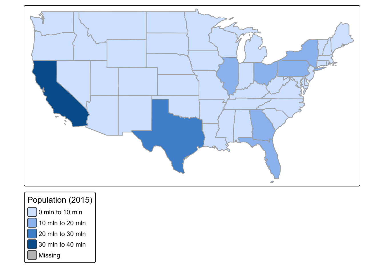
Using the us_states dataset, create a choropleth map showing the total population in 2015 (total_pop_15). Add state borders with tm_borders().
Show/Hide Code
# Your code here
Show/Hide Code
# Ensure us_states data is loadeddata(us_states)tm_shape(us_states) +tm_polygons(col ="total_pop_15", title ="Population (2015)") +tm_borders(col ="gray70")
Improve the map from Task 1. * Add a main title. * Change the color palette (try "YlGnBu" or "Reds"). * Add a compass and a scale bar. * Make the state borders white and thin (lwd = 0.5).
Show/Hide Code
# Your code here
Show/Hide Code
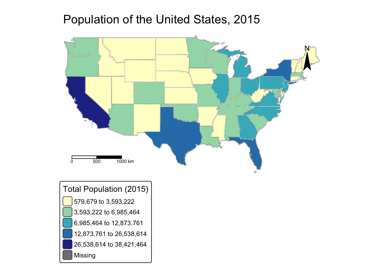
# Ensure us_states data is loadeddata(us_states)tm_shape(us_states) +tm_polygons(col ="total_pop_15", title ="Total Population (2015)",palette ="YlGnBu",style ="jenks"# Jenks style is good for skewed data ) +tm_borders(col ="white", lwd =0.5) +tm_layout(main.title ="Population of the United States, 2015",frame =FALSE,legend.outside =TRUE ) +tm_compass(type ="arrow", position =c("right", "top")) +tm_scale_bar(position =c("left", "bottom"))
1.5 Creating Maps with ggplot2
For those already familiar with the ggplot2 package, its “grammar of graphics” can be extended to create highly customized, professional maps. The sf package integrates directly with ggplot2 through a special geometric layer: geom_sf().
The core idea is the same as any other ggplot: you initialize a plot with ggplot(), specify your data, and then add layers. For spatial data, geom_sf() is the primary layer.
Worked Example: Mapping US Population with ggplot2
Let’s use ggplot2 and geom_sf to create a map of population density for the us_states dataset.
Show/Hide Code
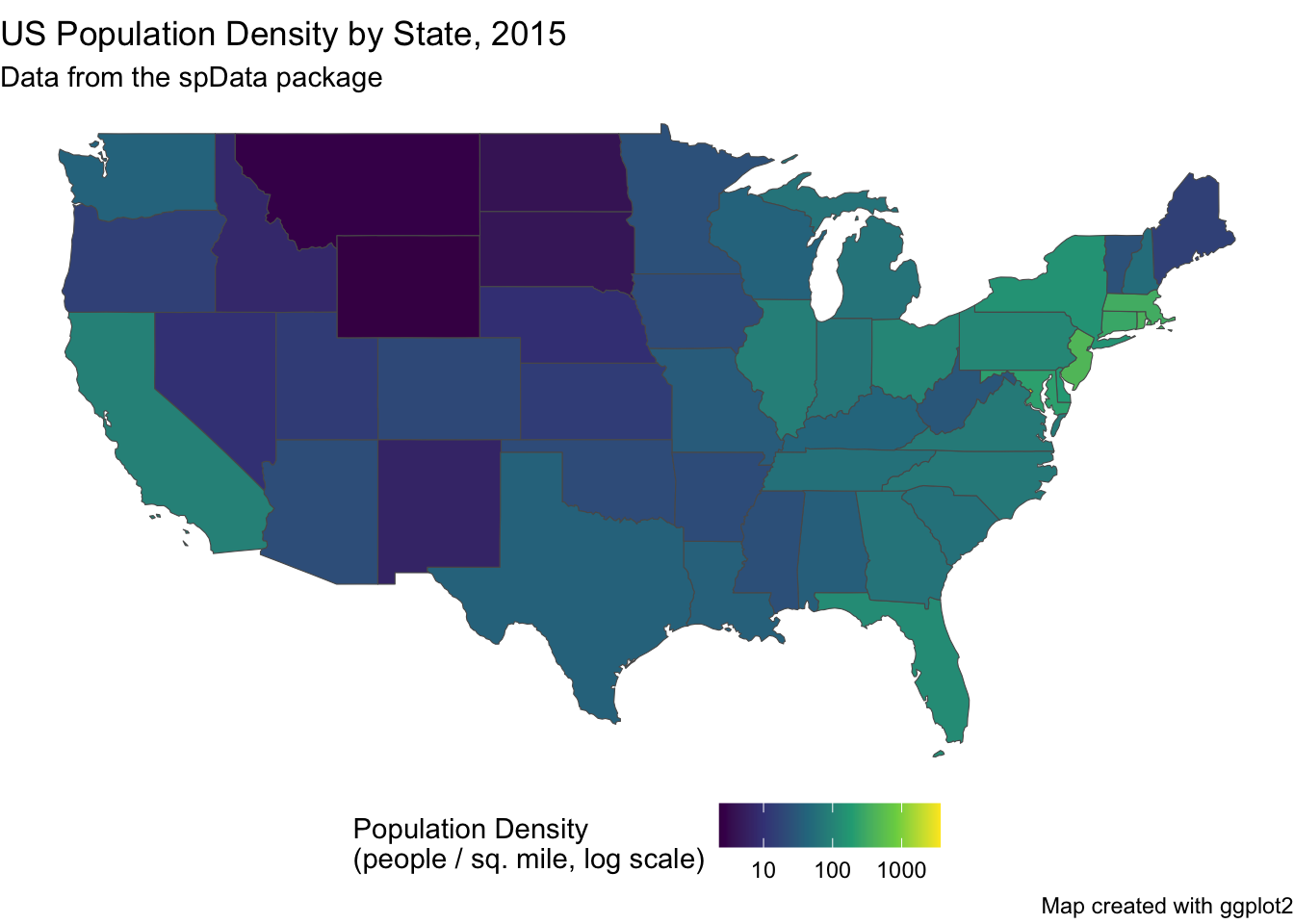
# Load the data if not already in the environmentdata(us_states)# We can add a new column for population density right in our pipeus_states_plot <- us_states %>%mutate(pop_density =as.numeric(total_pop_15 / AREA))# Create the map with ggplot2ggplot(data = us_states_plot) +# The main geometry layer for sf objectsgeom_sf(aes(fill = pop_density)) +# Customize the color scalescale_fill_viridis_c(trans ="log10", # Use a log scale for better visualization of skewed dataname ="Population Density\n(people / sq. mile, log scale)" ) +# Add titles and a clean themelabs(title ="US Population Density by State, 2015",subtitle ="Data from the spData package",caption ="Map created with ggplot2" ) +theme_void() +# A minimal theme, good for mapstheme(legend.position ="bottom")
Exercise 4: Thematic Mapping with ggplot2
Let’s use ggplot2 to visualize the economic data in the world_africa dataset we created earlier.
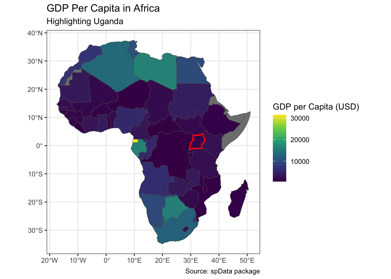
Improve your map. * Use scale_fill_viridis_c() for a better color scale and add a title to the legend. * Add a main title and a subtitle to the map using labs(). * Apply theme_bw() for a cleaner look. * Add a black border layer for Uganda (uganda_sf) on top of the other countries. (Hint: Use a second geom_sf() call, but set fill = NA so it doesn’t cover the colors).
Show/Hide Code
# Your code here
Show/Hide Code
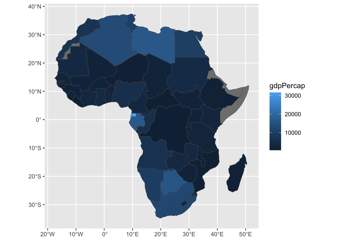
# Assuming 'world_africa' and 'uganda_sf' are loadedggplot() +# Layer 1: African countries colored by GDPgeom_sf(data = world_africa, aes(fill = gdpPercap)) +# Layer 2: Uganda outlinegeom_sf(data = uganda_sf, fill =NA, color ="red", linewidth =0.8) +# Customize scales and labelsscale_fill_viridis_c(name ="GDP per Capita (USD)") +labs(title ="GDP Per Capita in Africa",subtitle ="Highlighting Uganda",caption ="Source: spData package" ) +theme_bw()
Module 1 Conclusion
Congratulations on completing the first module!
You have acquired the fundamental skills for working with spatial data in R. You have learned how to use sf and dplyr to manage and query vector data, how to use terra to perform essential operations on raster data, and how to turn that data into clear, informative maps.
Specifically, you now have two mapping tools to work with: * tmap, which provides a straightforward grammar for creating both static, publication-quality maps and useful interactive maps for data exploration. * ggplot2, which extends its famous grammar of graphics to spatial data with geom_sf, allowing for detailed customization and integration into a tidyverse workflow.